In partnership with the Growth team, I took a closer look at our entire funnel and streamlined design and messaging throughout. From the front page and app download page, to the in-app onboarding flow and onboarding emails, I simplified and rewrote everything to make sure that Framer X’s value prop and unique selling points were clear at all points in the customer journey.
Home page header
Since it’s important to communicate your product’s value proposition from the get-go, I wrote this header to make it clear to potential users what Framer is and exactly what they can use it for.

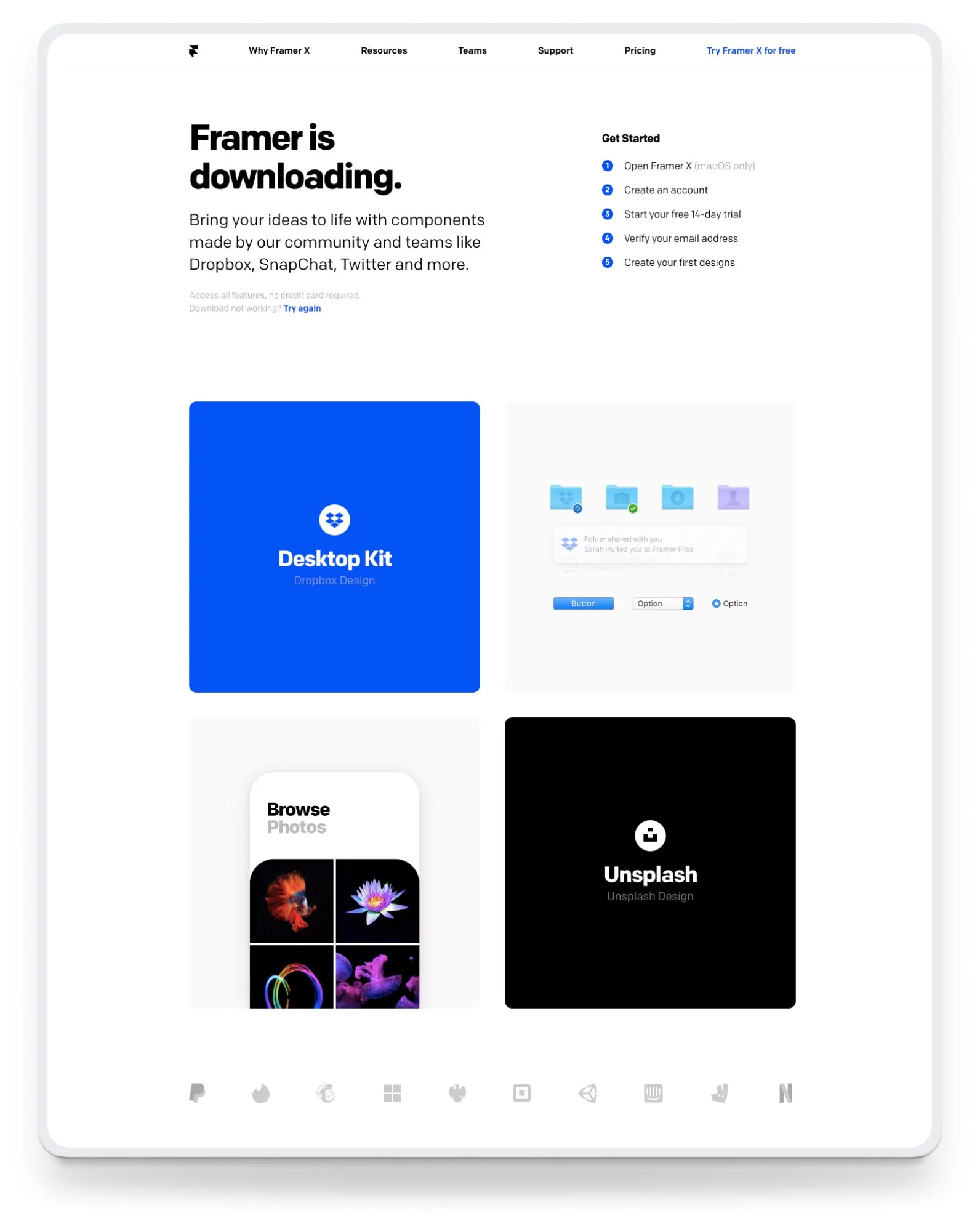
Download page
When a new user clicked any of the “Try Framer X for free” buttons on the home page, they were taken to the download page and the app would start downloading immediately. We decided to include a section called Get started to set expectations for next steps in the flow, and we added some copy that reinforced one of Framer’s unique selling points—free community-made design and code components.
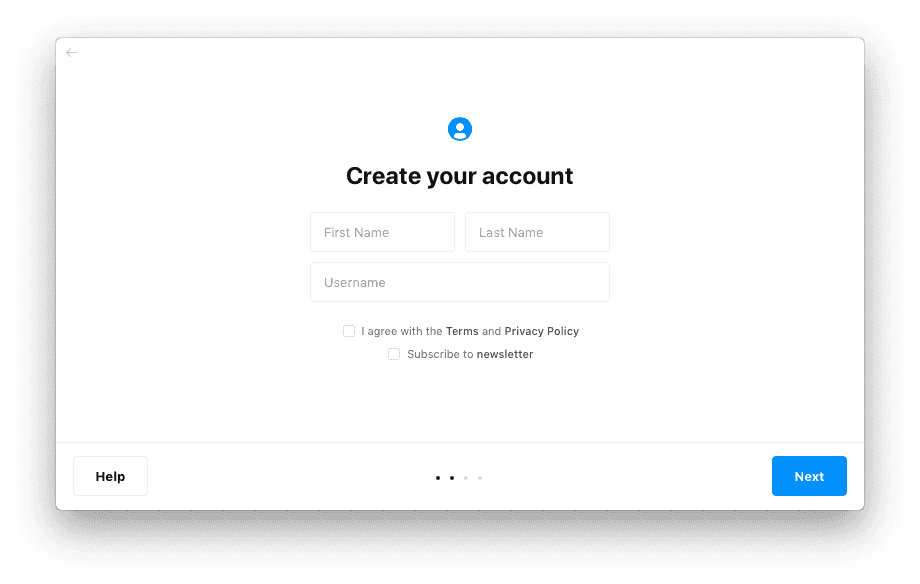
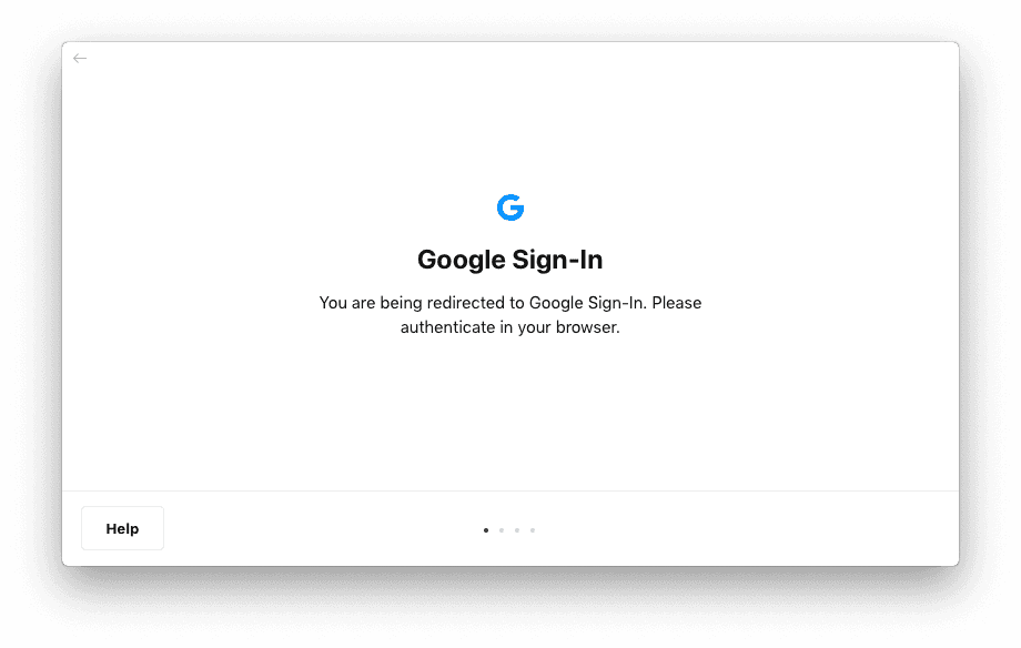
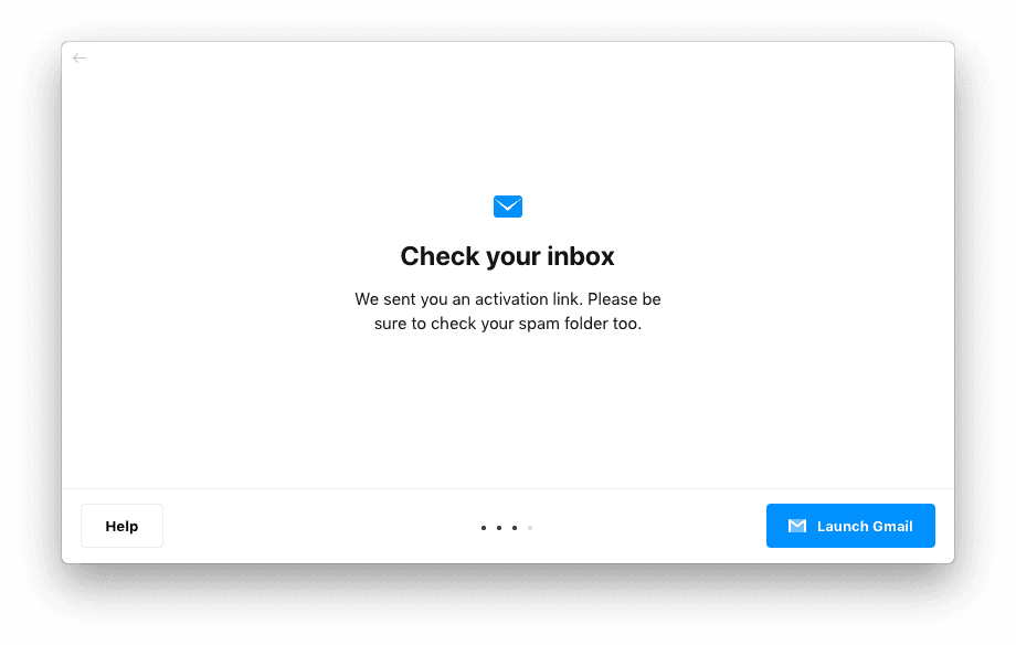
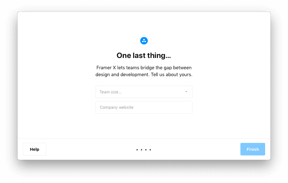
In-app onboarding
When a user would open the Framer app after downloading it to their desktop, they had to create an account in order to move forward. We added Google authentication to make it easier for new users to get started right away and for returning users to sign in.